


Is a Graphic Resume Design Right for You?
Get a Free Expert Review5 min read. Updated on November 07, 2024
Table of contents
Table of contents
Table of contents
Table of contents
Is using a graphic resume design worth it?
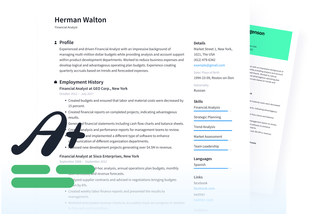
Decorative resumes on colorful paper may look pretty, but they are often tossed to the side right away. While hiring managers love unique content that's organized into an easy-to-read format, they aren't as pleased with resumes that include logos and a ton of color. These resumes can appear unprofessional and silly.
However, there are a few careers where the use of a visual resume can be a great way to demonstrate your ability. Yet, when is a creative resume too much? Here are a few suggestions to help you decide when, and if, you should use a graphic resume.
When to use a graphic resume
Only professionals in certain careers should consider using a graphic resume design — period. These include web designers, advertising specialists, artists, and graphic designers. If you don't work in these fields, stay away from using a creative format, and instead opt for a simple resume design. If you work or are pursuing work in a field where a graphic resume design is appropriate, it's a good idea to also have another version of your resume handy that is free of graphics and uses a simple, clean design. When you apply to a job online and upload your resume through an employer's application tracking system, it's important to remember that the ATS software cannot see the graphics you worked so hard to create. Stick to simple, graphic-free resume design for your online applications and save the visual resume when you're emailing or snail mailing your resume to someone.
[[CTA]]Related: Why a Simple Resume Layout is a Successful Resume[[/CTA]]
Place emphasis on the content
Whether you choose a graphic or a standard resume format, the emphasis should be placed on its content. Graphic resumes still follow the basic resume format: title, summary, key skills, experience, education, and professional development. Focus on the content as much as the design and layout, using strong action verbs, achievement statements, and contributions.
Optimize your resume content using these basic techniques: word choice and placement.
Choose your words carefully. Remove articles, such as “the,” “a,” and, “an,” from your resume. They are not necessary and take up a lot of room. Use action verbs and achieving language, staying away from standard job descriptions that often advertise you as a doer rather than an achiever. In addition, search for, and incorporate, keywords related to the job.
Organize your information strategically. The organization and layout of your content are just as important as the information itself. As you're evaluating the content on your resume, consider the importance and priority of each piece of information, if it's redundant or if it adds value, and if there's a better way to highlight the most relevant pieces of information. For instance, examples of measurable success and other highly marketable selling points should be called out using bullets underneath each job position in your work history.
Stay away from infographics
Advertising designers are used to displaying raw data into design formats. However, rather than listing sales increases and new contracts in an infographic, look towards the individual position. Create a section for key achievements and notable contributions below each position, and list those key pieces of information in bulleted format. This connects your best career moments with the job where you accomplished them.
Portfolios speak louder than words
Candidates often mistake their resume as an extension of their portfolio. Your resume is simply a one- or two-page summary of your career, abilities, and skills.
In addition to sending a graphic or simple resume, a well-organized portfolio of your best five projects is highly useful. Once your resume is complete, include a cover letter and an attachment of your portfolio. This serves to display certain design skills better than a graphic resume.
Consider the 6-second test
Studies show hiring managers spend six seconds on average scanning resumes they receive. If your resume — whether it's a standard or graphic resume — doesn't display your top achievements, experience, and education within six seconds, chances are your resume will land in the trash. If you place too much emphasis on design elements and graphics, that is all the hiring manager will see.
Take the six-second test to determine if your resume is optimal:
Highlight five to eight key skill requirements from a job advertisement in your field.
Fold the first page of your resume in half.
Set your phone's alarm clock to about six seconds.
Count how many key skill requirements and accomplishments match the above highlights.
If you could skim your resume in that amount of time, count at least five highlights, and understand your abilities, the test was a success. This test is more accurate when you have a friend, particularly someone outside your field, skim your resume in 10 seconds or less.
[[CTA]]Related: How to Pass the 6-Second Resume Test[[/CTA]]
Applicant tracking systems (ATS) don't read graphics well
ATS software scans resumes received by hiring managers, looks for keywords applicable to the targeted position, deletes resumes not meeting those criteria, and stores candidates' information electronically. If the ATS finds too many elements it cannot read or understand, the system will delete your resume and the hiring manager will never know you existed. It's best to leave these elements off your resume as ATS programs don't work well with them:
General titles
Custom headings
Images, columns, and tables
Special characters and fonts
Free Resume Review
Ensure your resume aligns with what employers are actually searching for.
How to replace a graphic resume design with a different format
After taking out logos, special fonts, characters, and art, you may look at your resume and think it's a little dull. Never fear, as there are ways to make a more creative resume layout without damaging your chances of landing an interview.
First look at your main title. Your name, targeted position, and contact information should be prominently displayed at the top. Play around with the lettering, while keeping the font basic.
You can also:
Add a border to the outside of the document to help “contain” the content.
Format job titles and positions with bold or italics.
Make sure each section should have a header.
Use borders and shading to make those areas more attractive.
Just remember too much will confuse the ATS and hiring manager.
In the end, be consistent with your formatting treatments and don't overdo it. In the case of your resume's design, less truly is more. You want to advertise yourself without actually appearing to advertise yourself.
Click on the following link for more resume advice.
Recommended Reading:
See how your resume stacks up
Related Articles